Understand CPI (Cost Performance Index)
What is this?
CPI means Cost Performance Index. It tells you how much work you got for each dollar you spent. Clue divides the expected value of the work done by what it cost. A CPI above 1.00 means the work cost less than budgeted.
Who's this for?
- Project managers, to find the projects and cost codes that lose money.
- Superintendents, to see which crews or weeks fall behind on cost.
- Owners and executives, to compare jobs of any size on one scale.
How to use it
Step 1: Find the CPI chart
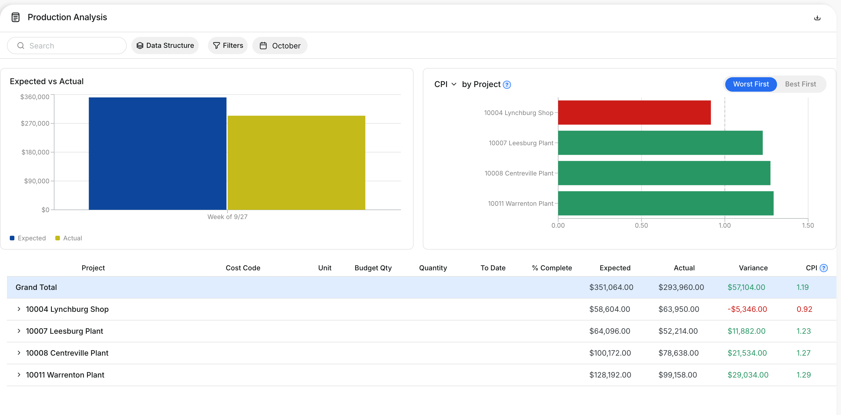
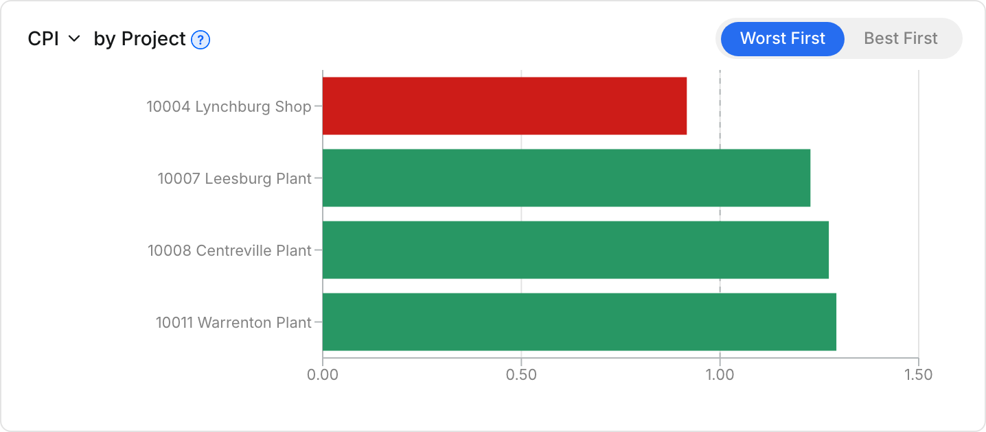
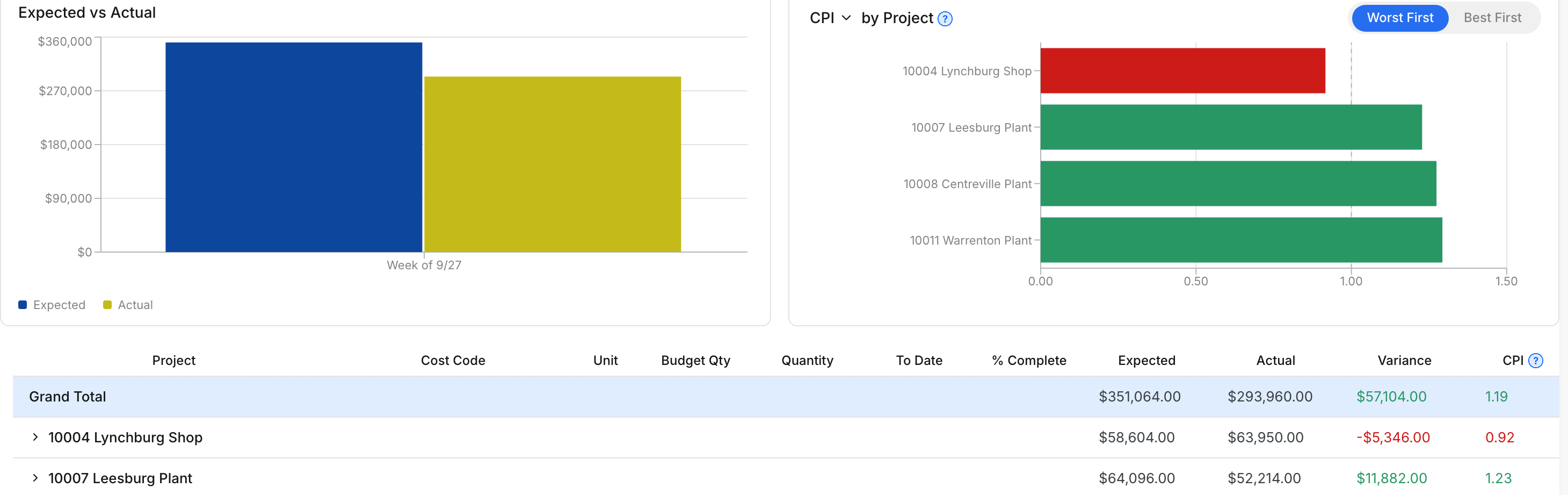
Go to Insights > Reports > Production Analysis. The CPI chart is on the right, above the table.
Step 2: Read a bar
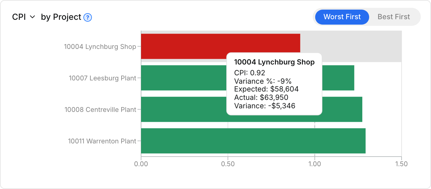
Point to a bar to see its numbers. You see CPI, Variance %, Expected, Actual and Variance.
Step 3: Switch between Worst First and Best First
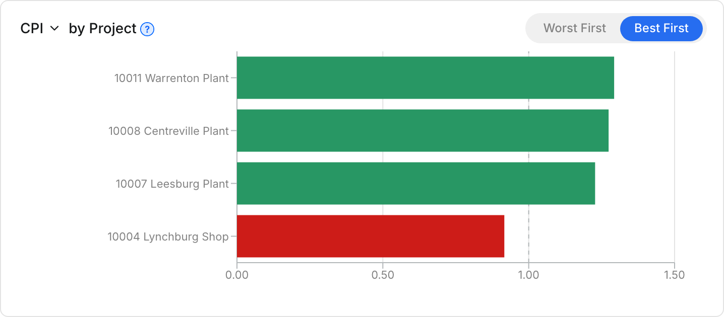
Click Worst First to see the problems at the top. Click Best First to see your strongest results at the top.
Step 4: Change what the chart shows
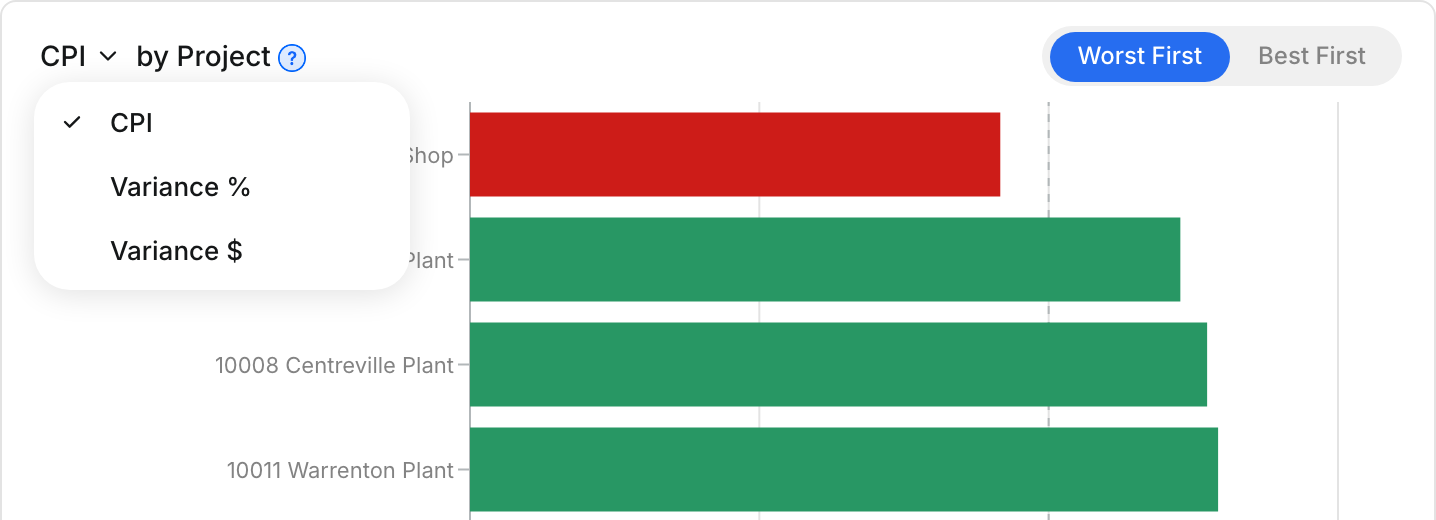
Click CPI at the top of the chart. Choose CPI, Variance % or Variance $.
Step 5: See the dollar amounts
Choose Variance $ to rank by dollars over or under budget. Bars to the left of $0 are over budget.
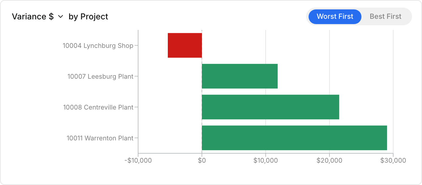
Step 6: Check CPI in the table
The CPI column in the table uses the same math. Open a project row to see the CPI for each cost code.

The full details
- CPI: Expected $ divided by Actual $. 1.00 means the work cost exactly its budget.
- Above 1.00: the work cost less than budgeted. 1.20 means $1.20 of work for each $1.00 spent.
- Below 1.00: the work cost more than budgeted.
- Variance $: Expected minus Actual, in dollars.
- Variance %: Variance $ as a share of Expected. +20% means 20% under budget.
- Colors: green bars are at or above break-even, red bars are below it.
- Dashed line: the break-even point, 1.00 for CPI and 0 for a variance.
- What it ranks: the first level of your Data Structure, for example by Project.
- Top 10: the chart shows up to 10 bars.
- Periods: when the first level is Month, Week or Day, bars stay in date order.
- Left out: groups with no actual cost do not show.
- No budget: groups with cost but no budget have no CPI, so CPI and Variance % leave them out. A note under the chart counts them. Variance $ shows them.
- Table CPI: green at 1.00 or more, red below 1.00, blank when there is no budget or no cost.
Tips
- Use CPI to compare jobs of different sizes. A small job 30% over budget ranks above a large job 2% over.
- Use Variance $ to see where the most money goes.
- Clue remembers your chart choices on this browser.
- Point to the ? beside CPI for a short reminder of what it means.