Labor Utilization Report
What is this?
A report that shows how your team's labor hours break down into billed and unbilled time. The summary donut chart gives you an instant read on overall utilization. The table below breaks it down by shop and person so you can see exactly where time is going and who has capacity.
Who is this for?
- Shop Managers - See which shops run at high utilization and which have idle capacity. Spot the difference between a slow week and a staffing problem.
- Operations Managers - Compare utilization across shops, projects, and time periods. Use the data for staffing decisions and budget planning.
- Finance - Track billed vs. unbilled labor for accurate job costing and client billing.
How to use it
Step 1: Open the report
Go to Reports in the sidebar and click Labor Utilization. The summary at the top shows total hours, billed percentage, and unbilled percentage in a donut chart. The table below shows the breakdown by shop.

Step 2: Set your date range
Click the date picker in the top bar. The default is the current month. Change it to any period you want to analyze. The summary and table update immediately.
Step 3: Filter by shop, job title, or project
Click Filters to narrow the report. Filter by Shop to compare locations, by Job Title to see only mechanics (or only welders), or by Project to see labor allocated to a specific job.

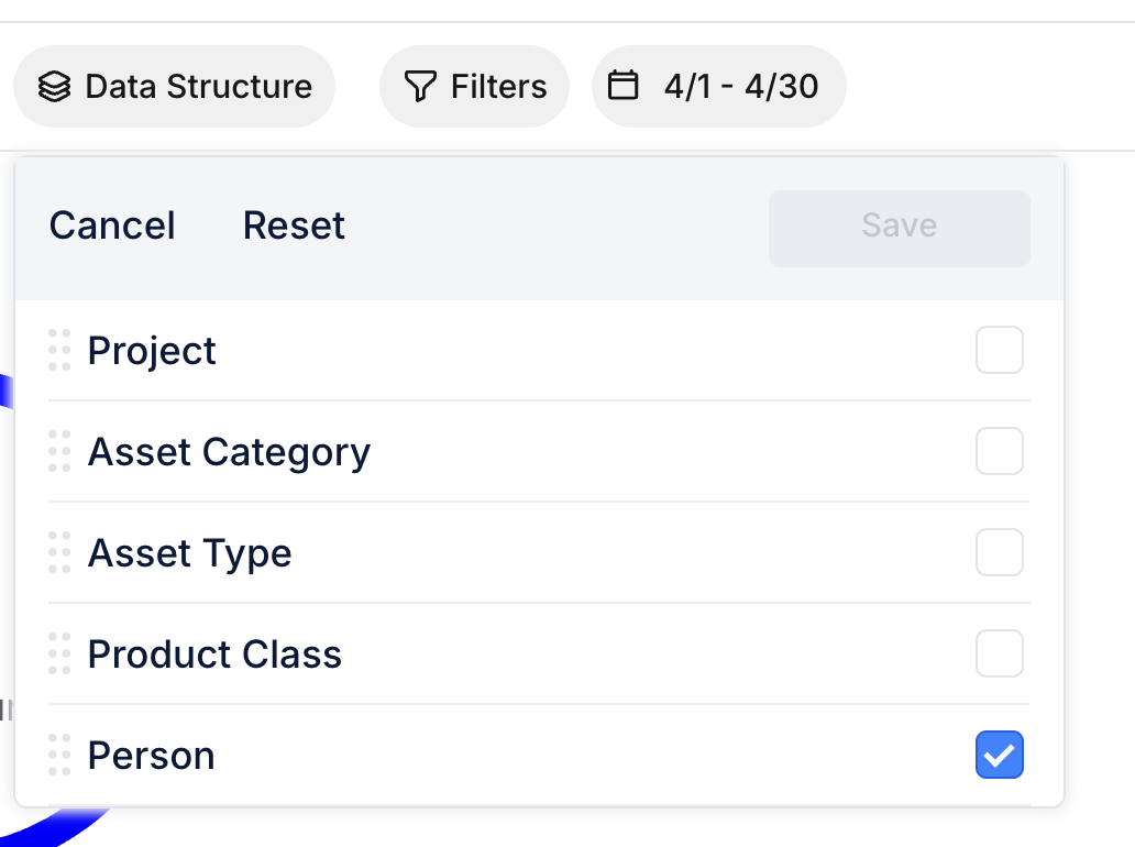
Step 4: Choose your data grouping
Click Data Structure to control how the table is organized. Check the levels you want: Project, Asset Category, Asset Type, Product Class, Person. The table regroups to match.
Step 5: Drill into the details
Click the arrow next to any shop to expand it and see individual people. Each row shows: headcount, total hours, billed hours, unbilled hours, utilization %, average hours per day, and top project.
Reading the numbers
Here is how to interpret what you see:
- Utilization % = Billed Hours / Total Hours x 100. This is your core metric. Industry target is typically 75-85%.
- Avg Hours/Day = Total hours divided by working days in the date range. Low numbers might mean someone was out or underutilized.
- Billed Hours = Time classified as billable based on labor type codes your admin has configured.
- Unbilled Hours = Travel, training, breaks, and other non-billable labor types.
The full details
- Works on: Web app
- Location: Reports > Labor Utilization
- Only approved timecards count. Draft or rejected entries are excluded from the numbers.
- Billable classification: Your admin configures which labor type codes are billable in Configuration. Example: "LABOR" and "INSPECTION" = billed. "TRAVEL" and "TRAINING" = unbilled.
- Default behavior: If no billable classification is configured, all approved hours count as billed (shows 100% utilization).
- Grouping levels: Project, Asset Category, Asset Type, Product Class, Person. Pick any combination.
- Export: Download the data for external analysis.
Tips
- Set up billable labor types first. Without this configuration, all hours show as billed and the report is not useful. Go to Company Settings > Configuration to classify labor type codes.
- Compare month over month. A single month does not tell the full story. Look at trends. A slow April might just be weather; three slow months in a row is a staffing issue.
- Use the Job Title filter for fair comparisons. Apprentices naturally have lower utilization than senior mechanics. Filter by job title to compare like-for-like.
- Check Avg Hours/Day for anomalies. Someone showing 2.0 avg hours/day in a full month either had significant time off or their timecards are incomplete.
- Filter by project to check job profitability. If a project is consuming lots of unbilled labor (travel, mobilization), that affects the project's true cost.